Marketing and psychology are inseparable. A great marketer involves psychology in marketing decisions. Marketing is not an exact science like math. It requires intensive research on people’s wants, needs, likes, and hates, which is why psychology makes marketing successful. Companies involve colors in developing their brand and marketing their products. For example, this work appears in the company logo, product label, product packaging, advertisements, flyers, posters, and more. Choosing the right combination of colors will give a personality to a brand. Colors have an impact on how we think and behave. They also direct us to where to look, what we should do, and interpret something.
Scientists have studied the psychology of colors for a long time, but the meaning of each color is still primarily subjective to the perceivers. Color works as a voiceless message to our customers. When we assign colors to visualize our brands, customers associate our brand with certain personalities—although these personalities will differ from one customer to another.
That means that not all of us react in the same way to the same colors as we have different experiences with them through significant events, upbringing, cultures, memories, and people. But there are a few generalizations that we can use as guidelines for color psychology in marketing. It’s the same thing if you’re planning to build a construction. You have to know the psychology of color so your inner colors will give you joy.
Psychology of Color: Yellow
Yellow is the visual representation of happiness, joy, and optimism. Almost anything positive and happy can be represented by yellow. Scientifically, yellow has an exceptionally long wavelength that gives it one of the most potent psychological meanings while staying the easiest color to perceive visually. Even infants respond to yellow first!
When you need to give your brand a positive vibe that lifts someone’s spirit or increases their confidence, uses yellow. But like anything else, using too much yellow is not recommended. Ill-proportioned yellow is known to cause anxiety and self-doubt. In marketing, that translates to customers thinking more critically before choosing your brand.
P.S: Do you think they call McDonald’s signature Happy Meal that name because the logo is yellow?
Psychology of Color: Black
Black is a color that connotes sophistication, seriousness, control, and independence. People often associate black with evil, mystery, depression, and sometimes even death. Black is a color that shows the absence of color — if that makes any sense.
Black is a recessive color that doesn’t stand out from others. However, the sturdy character of black makes people trust it and thus the brands associated with it. Black doesn’t compel people with calmness and trust as blue does. It causes people with its kind of self-confident charm. If black were to have a motto, it would be “we are who we are.”
Psychology of Color: White
White is a color that is pure and complete. That’s why it’s perfect for representing innocence, cleanliness, and peace. White contains an equal balance of all the colors, giving off several different meanings, with equality being the strongest. The idea that white is a color that represents a new start or a blank slate is strengthened by its common usage in wedding dresses, with a wedding representing a fresh start in life.
While white is an excellent color for simplicity and cleanliness, it is a fantastic color to create an idea. However, using too much white is likely to cause isolation, loneliness, and emptiness. Using purely white for your brand logo or visual design might not be a good idea. White is an excellent color for connecting other colors into one vibrant collaboration, but people tend to ignore standalone white because it’s relatively challenging to perceive visually.
In most cases, brands use some elements of white in their logo and visual content design in three ways:
- Pair it with a dark background.
- Setting it up as background color.
- Using it to connect other colors.
Psychology of Color: Brown
Brown is a visually mediocre color, meaning it’s not that noticeable in a crowd. But despite that, we often associate brown with security, structure, and protection. When it comes to an emotionally relevant person or possession such as family, friends, or wealth, brown offers constant support.
Brown is also a serious, down-to-earth, and sturdy color you can use when you think black is too intense. The drawback of using brown for a brand is that it’s one of the safest, risk-free colors. It’s not as strong as black, as fiery as red, or as cheerful as yellow. Brown can seem reserved, reluctant, scheduled, and boring. When necessary, use brown for your content, but don’t depend on it too heavily. Only a handful of well-known companies are brave enough to rely on brown for their logos.
Psychology of Color: Pink
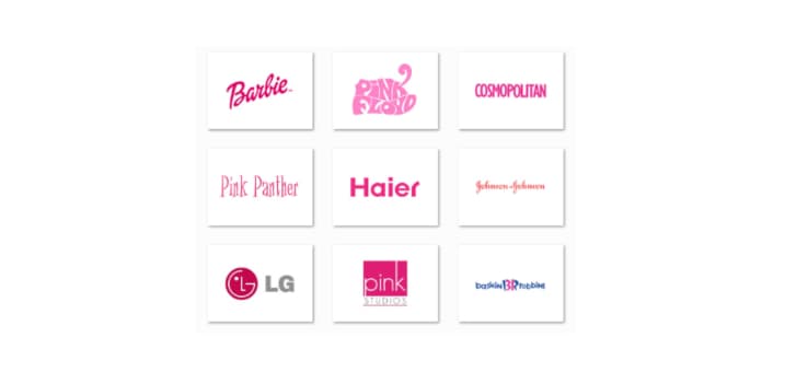
Pink is red’s kinder and friendlier younger cousin, creating a sense of compassion and love. Although it’s very much a physical color like red, it soothes rather than stimulates. It prompts a physical reaction by communicating with emotional drive. That makes pink a perfect color to show that your brand cares, understands, and nurtures its customers. Pink is also a sign of hope, romance, empathy, and sensitivity. For that reason, you commonly see pink in cancer organizations, products for little kids, delicate items, cosmetics, and toiletries.
Psychology of Color: Orange
Orange is what happens when the confident and ambitious red blends with the friendliness and positivity of yellow. The result is a vibrant color representing physical comfort in warmth, shelter, and food. In some cases, orange also stimulates our appetite. Companies that use orange in their branding and marketing aim for a generally similar brand personality: fun, lively, and enthusiastic.
Psychology of Color: Gold
Gold has quite a few different meanings depending on your culture. Across the world, though, gold consistently represents some variation of charm, confidence, luxury, and treasure. It also can have an element of friendliness, abundance, and prosperity that is naturally attractive. Too much gold, however, can seem egotistical, proud, and self-righteous. Like colors like brown and black, try to use gold more sparingly to highlight rather than be the main attraction.
Andre Oentoro is the founder of Breadnbeyond and Explainerd , an award winning explainer video company.